Google Pay UI tweak should make it easier to access NFC cards
- Haroun Adamu
- 19 feb 2022
- 2 Min. de lectura
A minor QoL imporvement

Google has been improving GPay to offer a more comprehensive digital wallet. The company launched a redesigned app last year and recently expanded its support to more countries. Now, users are getting a new update that makes accessing their NFC payment cards easier.
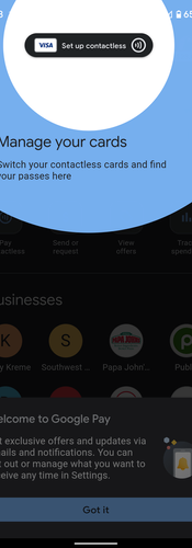
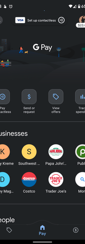
The change delivers a more prominent button for contactless cards at the top of the interface. These cards are commonly used at NFC terminals, so the adjustment makes it more obvious where you can access them. Before now, the button took the form of a tiny and subtle icon that was easier to miss. However, the new one will ensure you find the function at a glance and change things quickly before making an NFC payment.
The new GPay design went live in January but has since gained wider adoption, with more users getting the update. To get in on the look, you need to install the latest version of Google Pay. If you have a card already set up, you’ll see a “Ready to pay” button along with icons for NFC payments and your card — tapping on the latter brings up an interface to replace the current card or select a new one. If no card is selected, you get a “Set up contactless” button instead, along with a generic icon for any cards tied to your Google account. If you’re a new user, the app will display a drop-down message telling you what the menu does.
Google has also made an extra tweak to the app, causing it to display your current Google Pay balance right under your profile picture on the home tab. The quality-of-life update is just a tiny part of Google’s plan to dial back some of the regressions it introduced with its big redesign. The company also managed to get a total of over 3,000 US banks onboard and recently hired a PayPal veteran to steer the ship — it’s clearly moving in the right direction.


Comments